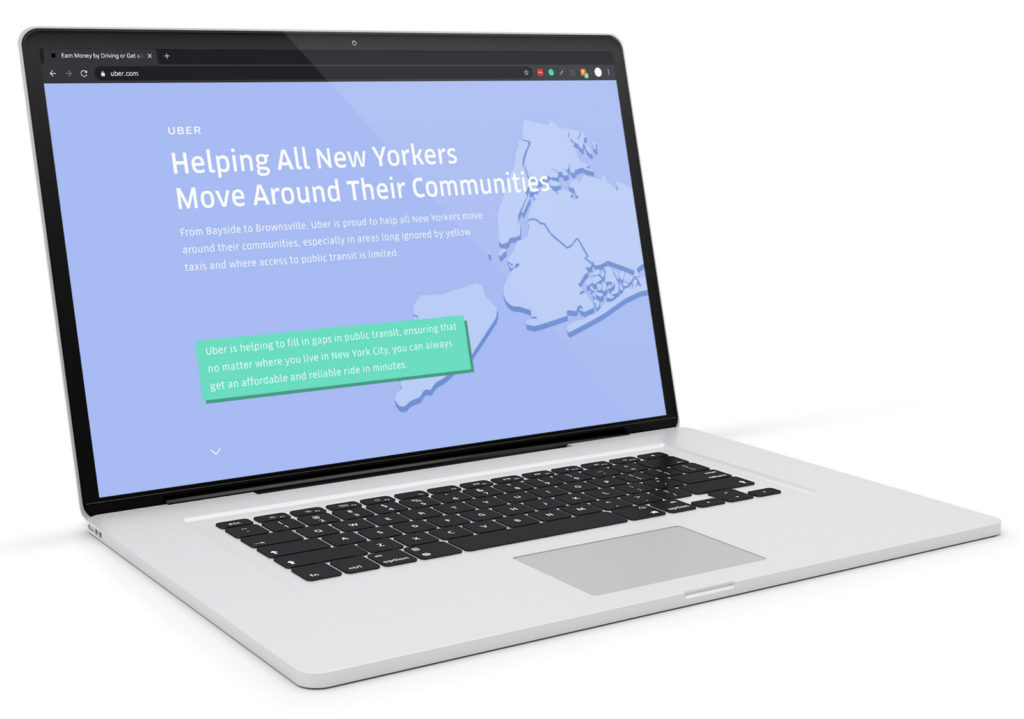
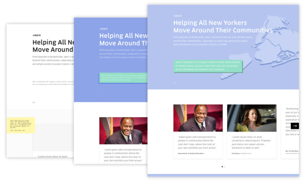
“Uber had a perception problem: they often struggle to shed their yuppy, black car origins and be seen as a viable public transportation alternative for all socioeconomic classes.”
My role as the UX Designer was to tell the story of transit islands in NYC and how Uber is filling the gap and making transportation more accessible and affordable.
This was a rapid 4 week design and development sprint to support Ubers scheduled marketing efforts in and around New York City.
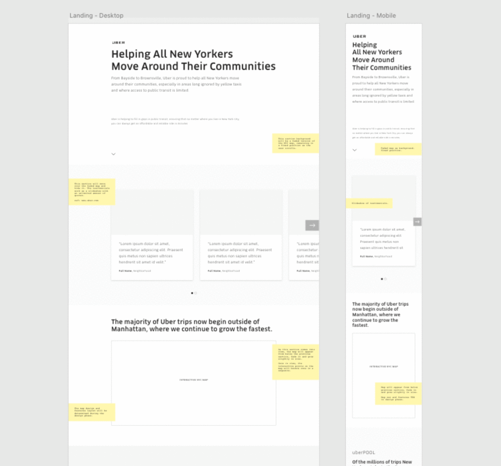
During the first week of the project, we worked with an internal Uber team to define content and feature requirements, which culminated in a confirmed wireframe model for both desktop and mobile including notes on user interaction points.
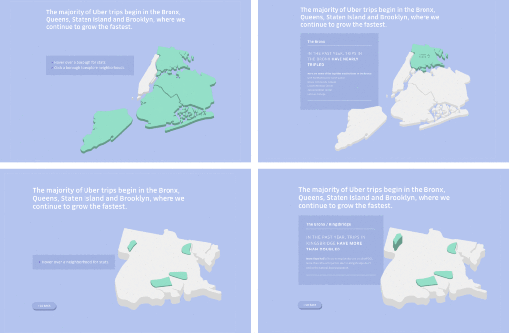
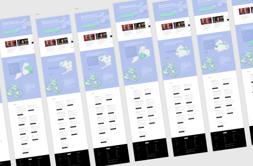
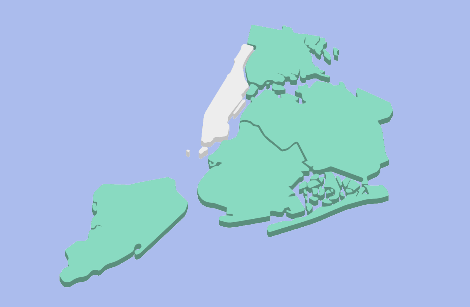
During weeks 2 and 3 I iterated and designed a 3-dimensional interactive map of New York City in order to provide an engaging and immersive user experience to display key statistics to support Uber’s marketing campaign.
The interactions were designed to be simple yet informative.
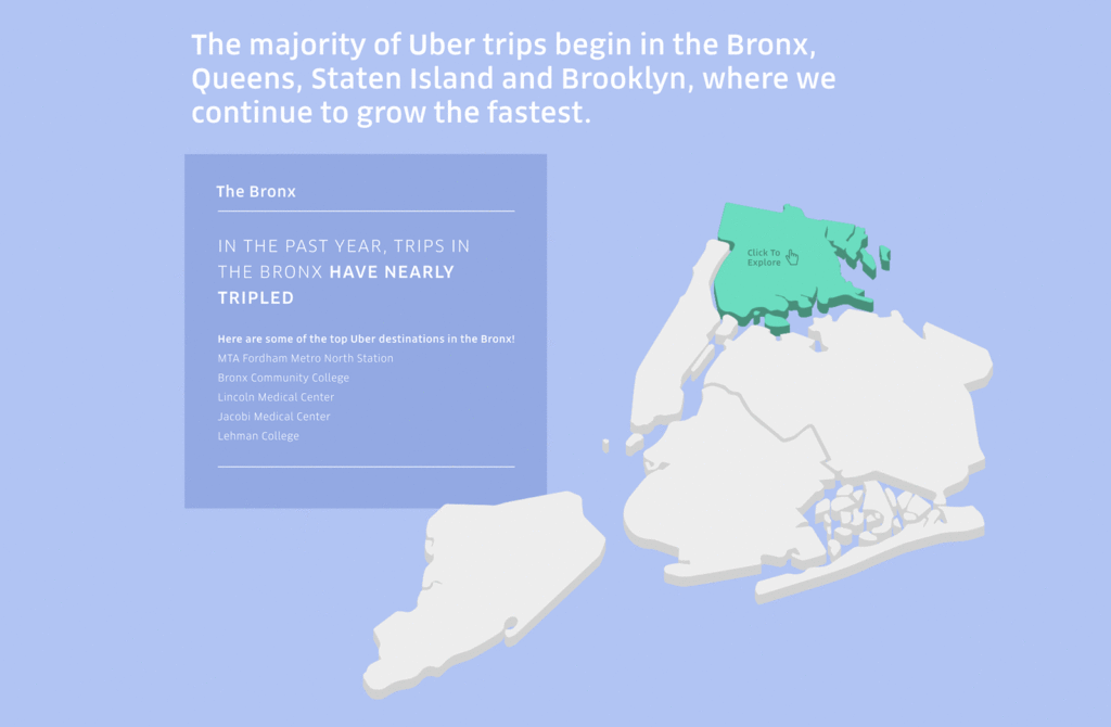
- Hovering over certain boroughs on the map, users are presented with infoboxes highlighting the benefits Uber brought to those boroughs.
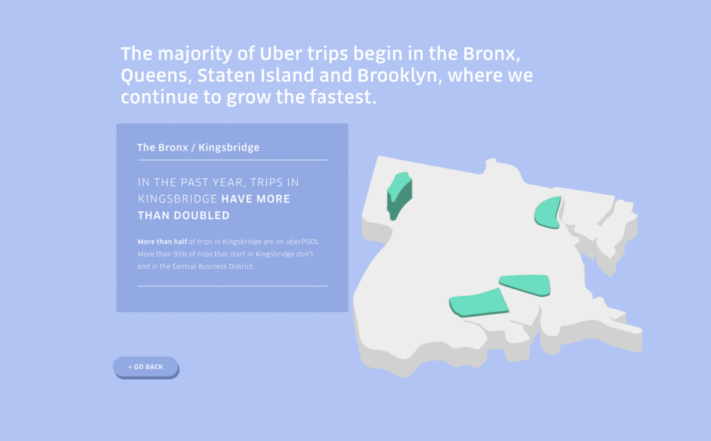
- By clicking through into the boroughs users are able to explore specific neighborhoods (or traffic islands) and see more specific details on how Uber is helping its residents travel around the city.

For the final week, I worked with a small development team to build out the page and interactive map, delivering the site on time and fully tested for the launch of Uber’s marketing campaign in New York City.
Thanks a lot for checking out my work, if you enjoyed it please check out the project on Behance and give it a thumbs up. And feel free to reach out if you have any questions or just want to chat.
Here are some relevant and useful links: